


The world is changing everyday! Don’t miss the latest trends in Creativity, Marketing and Business! We will bring the whole world to you.

Sliders in web design are one of the most controversial user interface units. Some people love them; some people hate them. The same goes for web developers: some developers cannot imagine a website without them; others never use them.
The main reason for such disagreement is that while website sliders are great instruments for displaying lots of information within a small space, at the same time, they can be SEO-killers, user experience blunders, and destroyers of marketing strategies. Therefore, with such strong arguments for and against, using sliders in web design is always a case of personal preferences.
Let us consider the essentials and pros and cons of sliders in web design as well as beautiful website sliders examples so that you can decide on your own whether to use carousels or not.
In essence, a website slider is just a carousel for displaying well-organized pieces of information one by one in a cycle. Its main constituents are:
On top of that, sliders in web design have a range of transition effects to avoid abrupt and overwhelming shifting between blocks of information. Modern website sliders examples are also populated with dynamic effects, interactive features, and various pioneering tricks.
Although a large share of developers talks colleagues out of using sliders in web design, there are some good reasons for using carousels on your website.
First, if you do not have much space but want to deliver lots of information, then carousels are just irreplaceable. No one likes to read long pages. With a compact and neat structure, carousels help to create a comfortable user experience. When the information is dished up in bite-sized portions and occupies a relatively small area, it is much easier to zero in on it, digest it and get real value.
Secondly, website sliders can be critical in achieving goals in the marketing strategy. Imagine you have an e-commerce store. Chances are you have a series of photoshoots of products. Predictably, you want to show these products from various angles or create a product tour so that your clients can fully appreciate the potential and value of the offer. A slider will demonstrate all these shots and keep prospects engaged despite their short attention spans.
Finally, there are many website sliders examples with testimonials that build trust and credibility in the online audience. Instead of creating a long page with numerous clients’ feedbacks, it is much better to gather everything under one roof, set a comfortable pace for cycling, and auto-play the carousel.
There are many other compelling reasons for using sliders in web design, such as
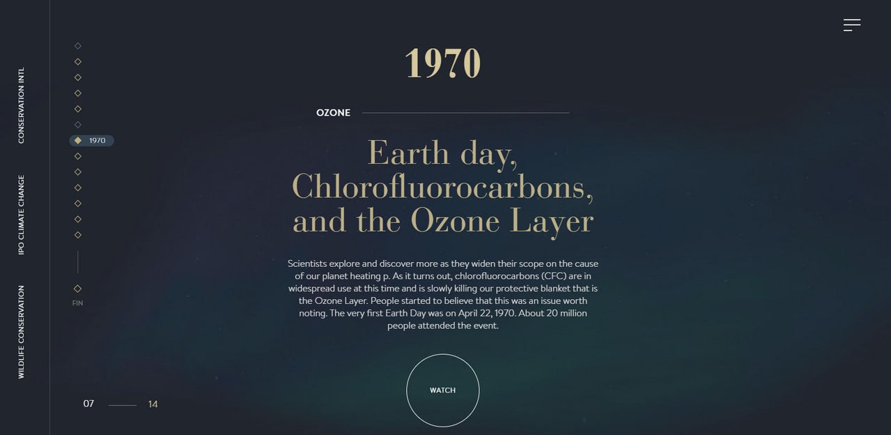
Climate History is a typical website slider example of nowadays that lures in the online audience with a splendid storytelling experience. The website aims to raise awareness about the burning issue without scaring people away. Therefore, the vertical slider where the content and dynamic solutions create a perfect symbiosis is just what the doctor ordered.
Here you can see 14 slides. Can you imagine a horizontal slider with the same amount? I bet it will kill the mood instantly. However, this is not the case. A vertical slider deals with this situation flawlessly. It tells the story and, at the same time, keeps people engaged.
Although the official website of Cloudforce cannot boast of the same impressive amount of slides, it has just 6; still, it is enough to create an impression.
Here a vertical slider is used to create a small, compact yet impressive microsite. It introduces the story behind the brand in a stylish manner. Each slide effectively represents the company. You can even see here a carousel on one of the slides. The user experience is engaging and intriguing. The idea is smart and well-realized.

The first one to consider is the Personal portfolio of Yannis Yannakopoulos, and Gosha Khidzhakadze are fantastic websites sliders examples of nowadays. Let us consider some more modern slider examples so that you can see the diversity of solutions and approaches that are used to take this fundamental UI element to the next level.
We have already outlined some strong reasons for using sliders in web design. It is time to throw some cold water on everything since there is a number of valid cons:
Some of these disadvantages are serious, like bad ranking in Google or poor accessibility. However, there is no obstacle insurmountable. For instance, if your slider affects page load speed due to heavy jQuery scripts, then it should be revised and properly optimized. The same can be done with the majority of items in the list.
When the slider is well-thought-out, there is no reason to avoid it. Let us consider some good tips on how to use sliders in web design along with good website sliders examples.
The web is teeming with website sliders examples, but not all of them bring benefits to the projects.
The deal is, your slider may have an impressive design or mind-blowing interactive features that make it look like a top-notch user interface element. However, if it does not bring value to the audience or even worse if it conflicts with marketing strategies or upsets the user experience, it will be useless or even harmful.
Consider two slider examples that demonstrate how you can fail the mission even with an awesome idea in the core.
Panamaera is a digital agency with creative juice flowing. The company has a single-screen website that is a popular choice these days.
Predictably, the horizontal slider is the heart and soul of it. It comfortably accommodates all the favorite works presented as short videos. It is spiced up with inspiring transition effects and mouse-based interactivity.
Without a doubt, the carousel does its job well: it displays content and draws attention with its modern look, but it lacks in good user experience. The reason for that is banal: navigation is a real nightmare.
There are no apparent ways to move through the slides. You will not find here customary left and right arrows as well as prev and next buttons. The bullets-based pagination is also missing. All you have is just a microscopic serial number that indicates the current slide. To make matters worse, the speed of cycling is high; you have to switch your attention all the time.
The rule of thumb: users should always be in control, and a way to gain this control should be evident from the get-go. No navigation – no user experience.

The same goes for the personal portfolio of Rik Wanders.
Again, we can see a one-screen promo page where a horizontal slider underlies the aesthetics. Unlike the previous example, it does not have any intricate features or modern tricks. Though, it certainly does have a sense of style.
What about navigation? Well, it is here where the shoe pinches. If you want to shift between slides manually, then you need to guess how to do this since there is no navigation nor pagination nor thumbnails, whatsoever. The catch is you need to use the keyboard to shift between slides. Therefore, for regular people who are accustomed to using a mouse for surfing through the web, it can be a true challenge to figure out that.

To deliver result with the slider, stick to these basic rules:
Sliders in web design can be classified according to various criteria. For example, depending on a purpose, we can break them into several categories:
Depending on the design and experience, we can break them into other categories:
However, in general, we outline just two main types: horizontal sliders and vertical sliders.
Whatever controversial, sliders in web design deserve special attention. Of course, they have many cons, but still, they have many pros. What’s more, in some cases, they are even irreplaceable. Therefore, as a rule, using carousels is a matter of taste and personal opinion.
We have considered outstanding websites sliders examples where the user experience is flawless. Sometimes, these intricate slideshows pushed our PCs to the limit; still, they produced a favorable impression, requiring just some good optimization to be impeccable.
Tell us, what do you think about our collection of beautiful sliders examples? What is your favorite solution? Do you use sliders in web design?
If you feel the urge to familiarize users with the important content from the first seconds of their staying on the website then the slider can come in handy. It is easily perceived by users and in the majority of cases becoming the first component that seizes the attention. Although it does not cover a bulk of data, yet it dishes it up in digestible portions that are much more efficient.
Moreover, like the owners of the above-listed examples, you can always play with the design and layout, transforming it from a simple plain box that just shows images into a masterpiece with strong aesthetics and animation effects that liven up the content and strengthen the whole impression. However, you should always remember the functionality and clear navigation tool.
Source: designmodo.com
The world is changing everyday! Don’t miss the latest trends in Creativity, Marketing and Business! We will bring the whole world to you.
CONTACTS
622 Emporium Tower, 21st Floor, Sukhumvit Rd. Klongton Klongtoey Bangkok 10110
+6626648882
FOLLOW US