The world is changing everyday! Don’t miss the latest trends in Creativity, Marketing and Business! We will bring the whole world to you.
Your homescreen might just be giving you a headache.
A number of big brands have recently subjected their logos and icons to controversial makeovers (we're looking at you Google). With most recent redesigns adopting the flat design trend, you'd expect things to look a little, well, flat. But, according to one designer, brands are now beginning to face a very different problem.
Apparently, the problem lies in the cognitive load facing users when looking at the apps laid out next to each other in situ. With oh-so-similar rainbow-fueled colour palettes and wacky uses of shape, are icons in danger of becoming too much to process? See the tweet below, and compare with our pick of the iOS app icon designs.

Tobias van Schneider posted the above tweet. He comments that "the cognitive load is real", and there's no doubt that looking at the image is an intense experience. These icons smack you in the face with vibrancy, but the end result is that it's hard to process exactly what you're seeing. It takes concentration to distinguish the icons from each other, which isn't necessarily something designers want to achieve. In short, it's overwhelming.
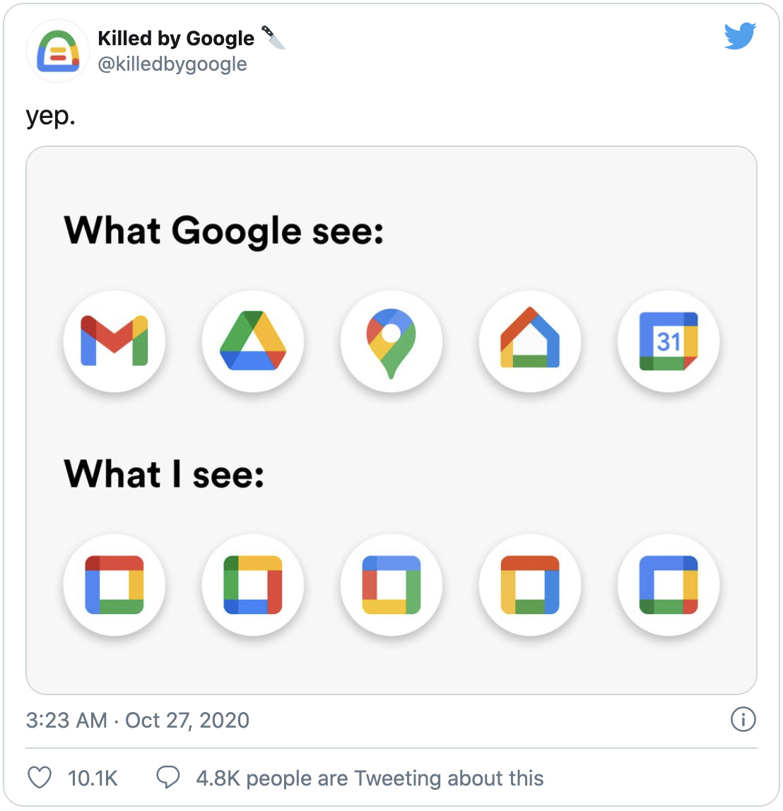
Though an array of shapes has been used to create all of these icons, the abstract concepts are so similar in style that none jump off the page. Throughout the thread, Google is named as one of the main culprits, and the below tweet succinctly sums up the issue:

The conversation is packed full of excellent design nouse, with critique covering a range of points from the exact issues with the design trend, to trends from the past users would love to see return.
Some users point out the benefits of minimal design:

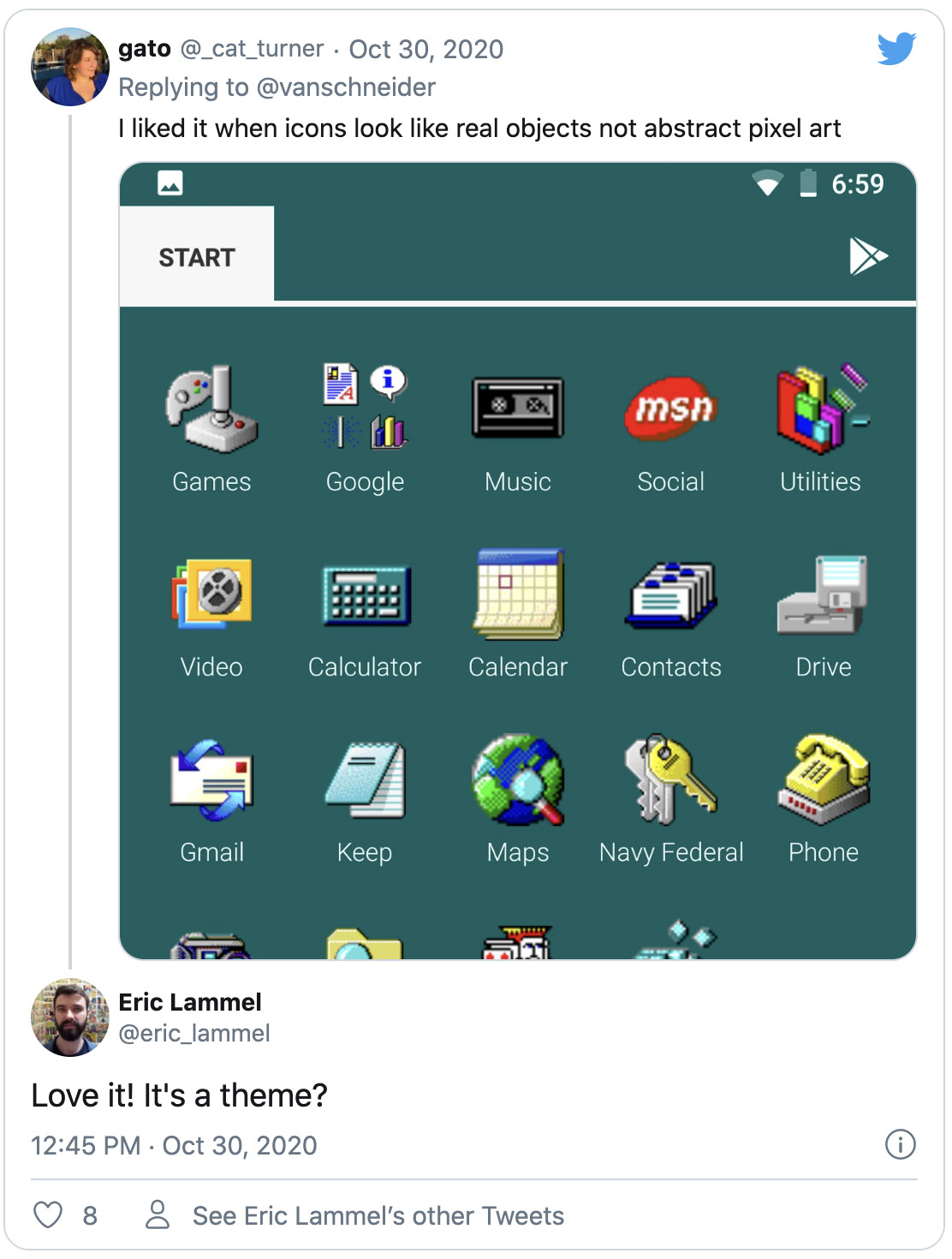
Others yearn for a return to realism:

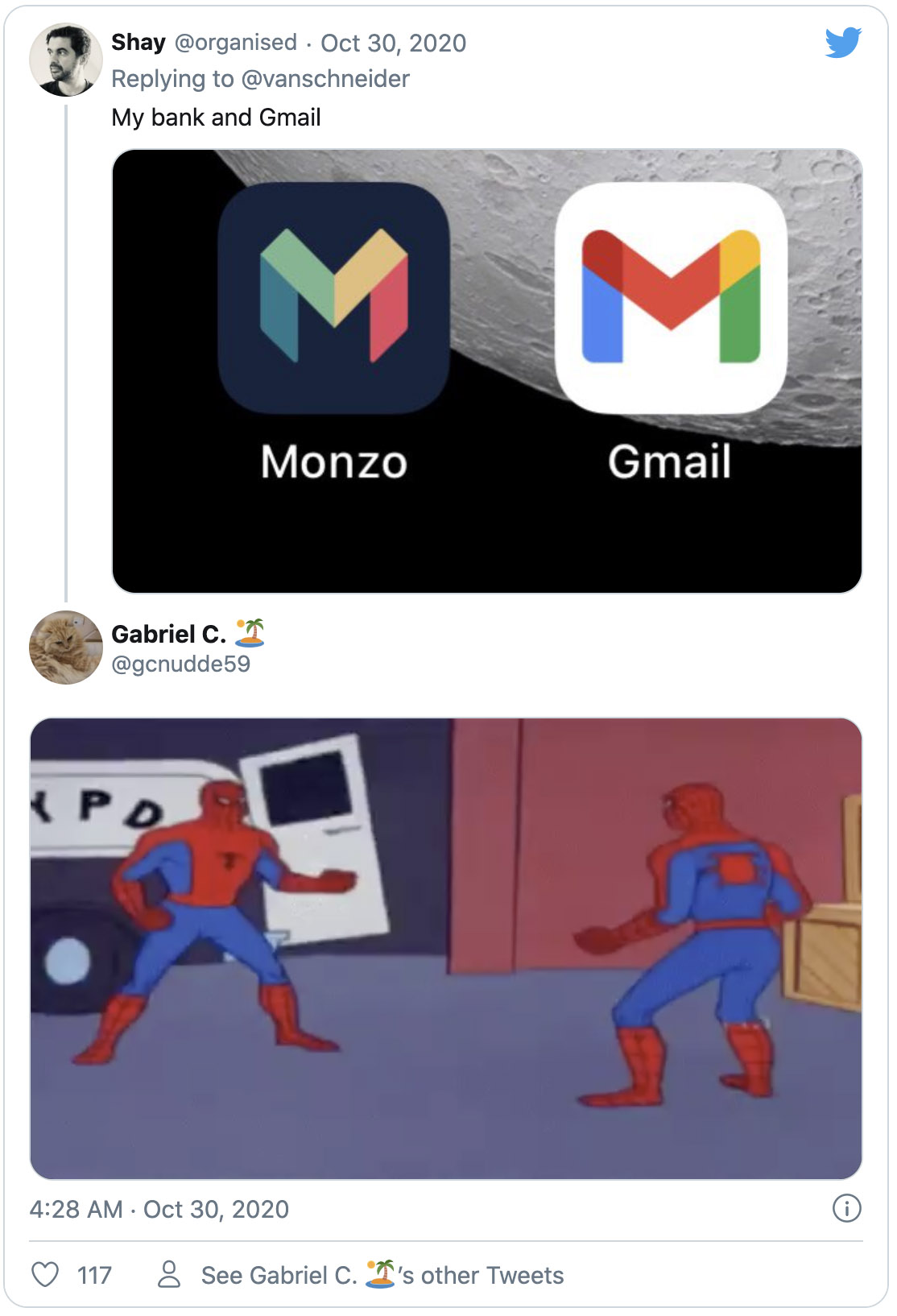
Some brands are a little too alike. Confusing, right?

Are brands surfing this rainbow-wave as a rebellion against some of the more tame flat redesigns of late? Or is it here to stay? We're certainly hoping for a return to skeuomorphism in 2021 (see the rest of our UI/UX design wish list right here), which would simplify things a little (and prevent us having to wear sunglasses whenever we look at our home screens).
It's crucial for brands to remember that they don't have to shout in our faces to get our attention, and doing so can often be off-putting. Individuality is key, and we're ready to see some understated personality.
Source: creativebloq.com
www.x2globalmedia.com
The world is changing everyday! Don’t miss the latest trends in Creativity, Marketing and Business! We will bring the whole world to you.